Is it Really Black?
By: Naomi J. Myrick, Staff Writer
The magnificent human eyeball interprets light differently. In print, there are many factors that affect the way signage looks to the eye. It can often be overwhelming. But when it comes to the question of, “is this really black?.” Oh boy.
Fear not, I can explain the differences.
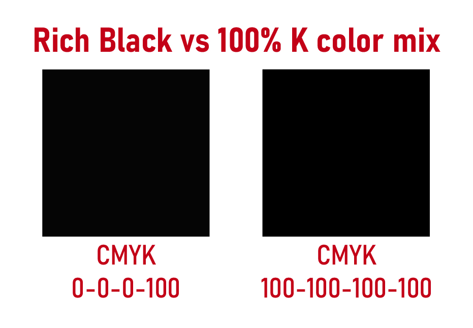
It boils down to the color formulas:
This simply means that when the ink is printed on a product, then there is literally more ink being applied to generate the blackest black — or K in CMYK.
Getting rid of the C, M and Y means on a grayscale between 0% (white) and 100% (black), your blacks will be reduced in darkness (gray) by 25%.
Adobe has settings that will usually adjust the black based on your preferences. However, the best way to ensure your black is the richest black is to set it to print in color vs grayscale.
Also, keep in mind that what appears on your device screen doesn’t necessarily represent what will show up on a printed product. But if you want the absolute best print solutions, we are the wholesaler for you.
And we have nothing against charcoal gray; but your customers might. This results in a dirty snowball effect that can irk us all. So if you have any questions, then please reach out to customer service or request a color match.